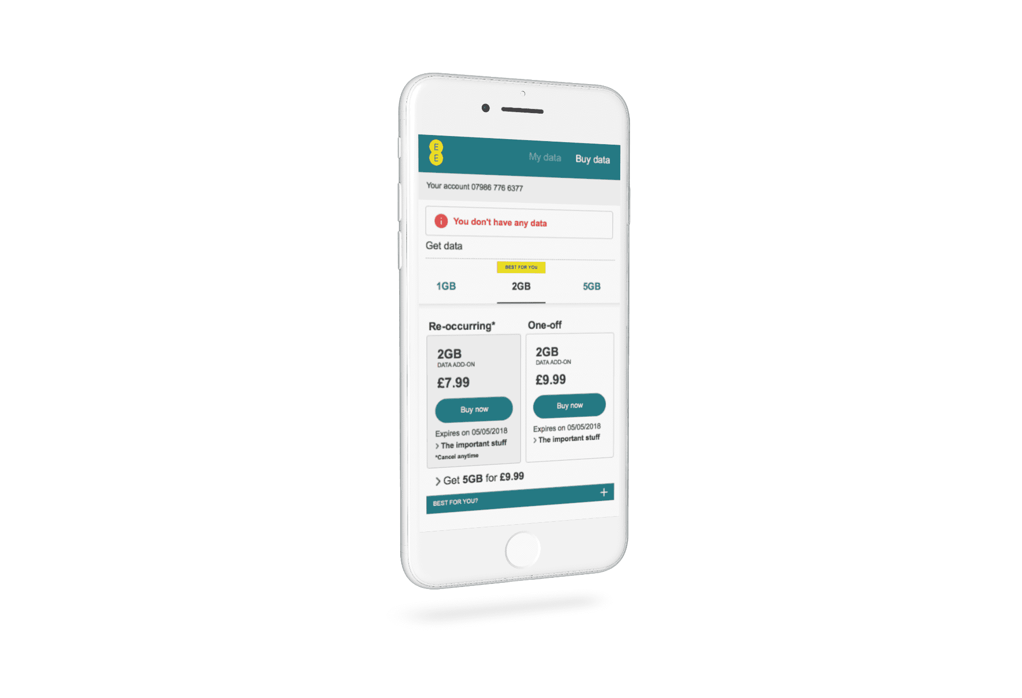
EE wanted to make the process of changing data packages for Pay as you go customers more straightforward and more intuitive.
Year: 2017
Roles: SeniorUX Designer
Position: UX Designer for the members teams
Overview
The existing data upgrade process for Pay as you go customers wasn’t intuitive and didn’t allow for the new functionality EE wanted to introduce. Since most customers would be upgrading on their mobile device, the design had to be mobile-first. The existing design wasn’t mobile friendly and very cluttered.
Research and Discovery
We had actual data and user videos showing how users typically updated data on their pay as you go accounts. We knew most transactions happened on the user’s mobile device.
Design ideas
We knew that most users were updating their data on mobile devices. We had to make it as easy as possible to navigate the different packages and compare them as quickly as possible on a device with limited screen sizes.
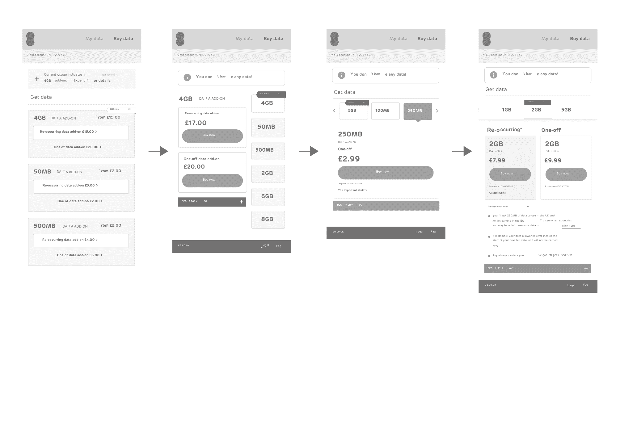
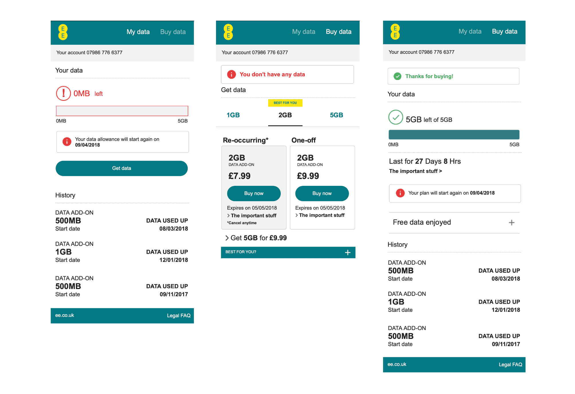
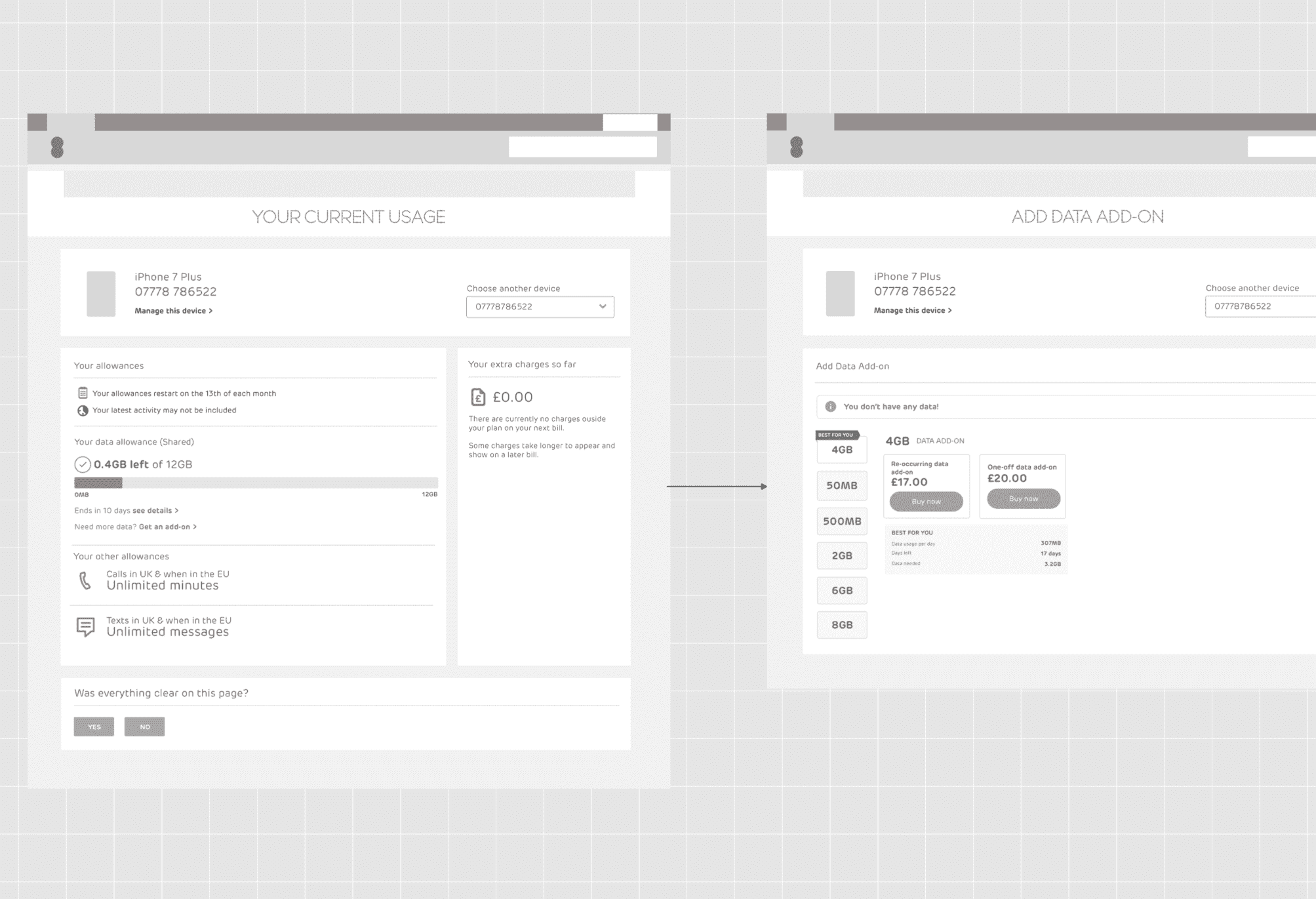
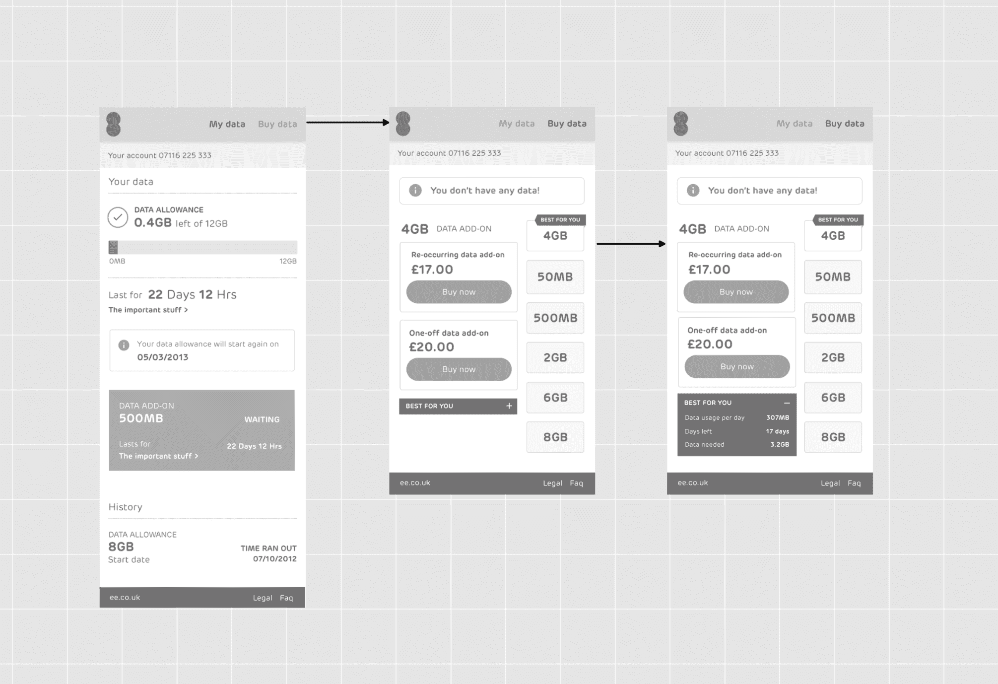
User testing and Prototypes
We experimented with numerous layouts and features whilst user testing the new data functionality. Starting with low fidelity wireframe prototypes initially, then eventually progressing on to a couple of high fidelity prototypes that testing well previously.
The Results
Data upgrades increased substantially after the new functionality was released to Pay as you go customers. It allowed the flexibility to change their data allowance as they needed it.